Color in a French Mediterranean Living Room
Color comes last. Why warm whites, muted olive, soft terracotta hold under southern light — and why bright contrast and cool greys rarely do.
LIVING ROOM
Color is noticed last.
In a French Mediterranean living room, it exists to support light and materials rather than to stand out. Under steady southern light, every tone reveals itself fully. What is unresolved becomes obvious. What is right settles quietly.
This is why color is introduced only once light, proportion, and materials are already in place.
Light-colored bases
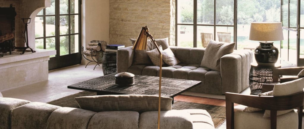
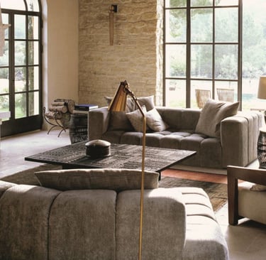
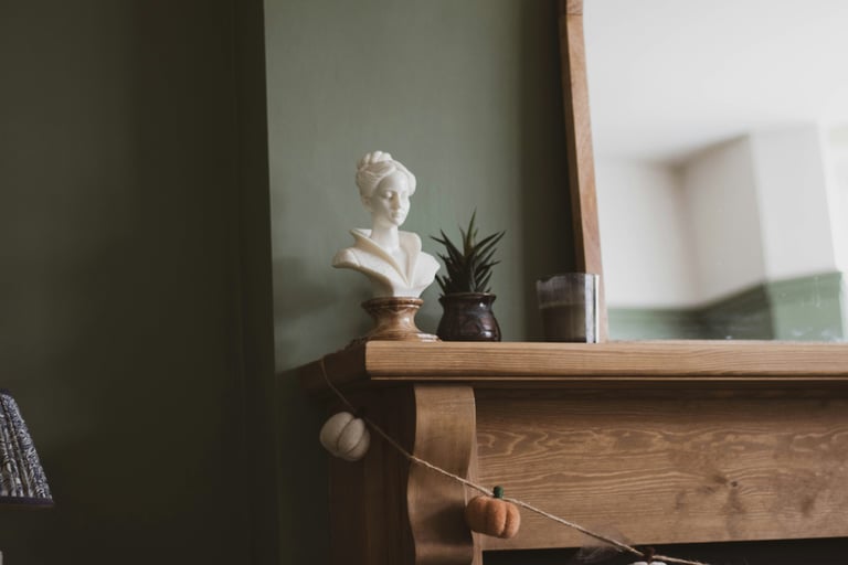
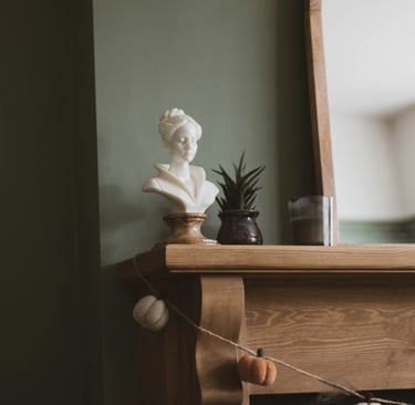
The foundation of the room is built from pale, mineral tones.
Linen, warm stone, and softened plaster tones reflect daylight without glare. They are typically carried across walls, larger upholstered pieces, and architectural surfaces.
They are not used for contrast or effect. Their role is to hold light without drawing attention.
Pure white tends to appear too sharp in this context. Strong contrast interrupts the continuity the room depends on.
Grounding and depth tones
Grounding tones introduce weight.
Muted olive, softened green, and warm earth tones settle into the room through upholstery, painted wood, and certain ceramic elements.
They anchor the space without becoming focal points. Used with restraint, they stabilise perception. Used excessively, they begin to flatten the room.
Charcoal, deep brown, and near-black tones extend the same logic — they replace true black in structural elements such as furniture frames or tables, creating definition without breaking the calm.
If any of this becomes noticeable, it has already exceeded its purpose.
Supporting tones
Supporting tones connect the room.
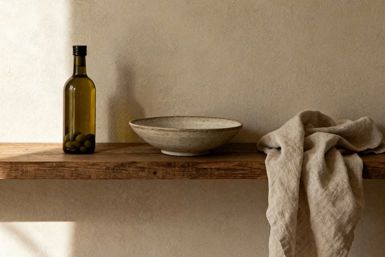
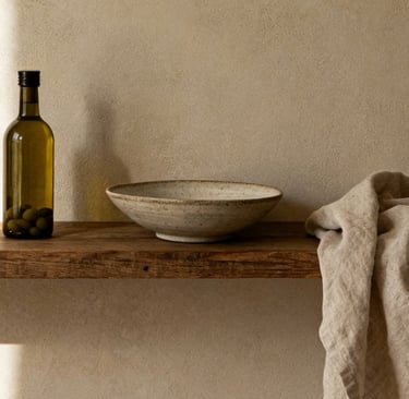
Soft clay, muted terracotta, and sand tones appear in textiles, ceramics, and smaller elements. They introduce warmth without becoming decorative.
They are not accents. They are transitions between light and shadow.
Color here should feel inevitable rather than selected.
What is intentionally excluded
Certain colors rarely hold under Mediterranean light:
high contrast palettes
cool greys
bright whites
saturated tones
These colors tend to dominate rather than support. Over time, they require correction.
Rooms that rely on color for interest rarely remain stable.
Color across the seasons
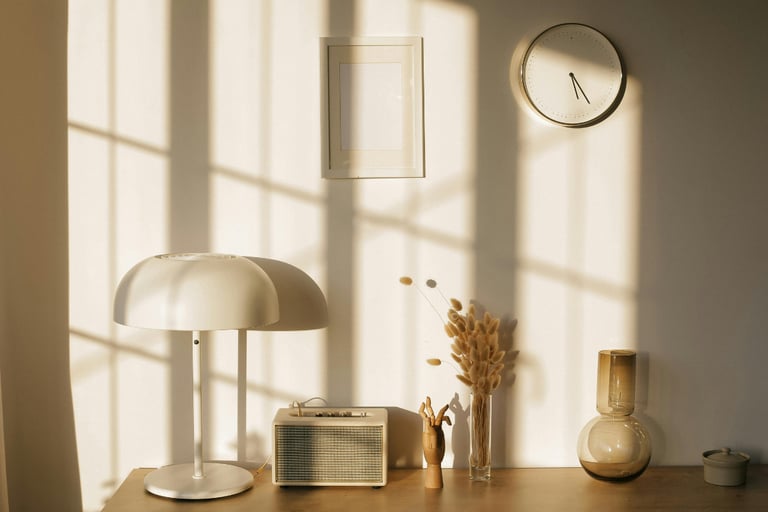
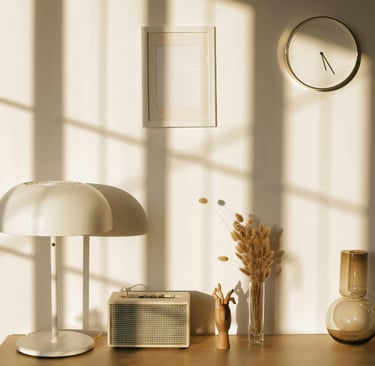
Southern light changes more than people expect.
In June, it is high, white, and almost colourless. In November, it falls lower and warmer, picking up the orange edge of late afternoon.
The same wall reads differently from one season to the next. The same sofa fabric appears almost pink in winter light and almost grey in summer.
Colors chosen for steady Mediterranean conditions are the ones that survive this shift. Warm whites do not turn cold under summer light. Muted olive does not flatten in winter. Soft terracotta deepens rather than fading.
The room does not require seasonal adjustments because the palette was already prepared for what the year does to it. This is why colors selected on a screen, or on a sample chip in a showroom, often fail in the room.
The wall absorbs whatever light is in the air.
The palette is judged by all the light it will live under, not the one moment it was first viewed in.
Color follows structure
Color only works when it responds to the room.
Light determines how color is perceived, a relationship explored in Light and Proportion in the Living Room. Materials shape how it is absorbed and how it ages over time, as seen in Materials and Finishes That Last in the Living Room. Seating, in turn, determines where color settles and how it carries weight within the room, a logic that becomes clearer in Seating in a French Mediterranean Living Room.
When these conditions are clear, color choices become limited and precise.
A final measure
Not every tone belongs.
Each color must:
remain stable under steady light
support material and proportion
avoid drawing attention
This restraint is not aesthetic preference. It is what allows the room to remain calm over time — a calm that depends on material behaviour rather than colour selection, as The Difference Between Natural and Neutral explores.
If a color needs explanation, it usually does not belong.
Contact
© 2025. All rights reserved.
An editorial study of French Mediterranean interiors, shaped by observation, lived experience, and a respect for spaces that age gracefully.