The Difference Between Natural and Neutral in a Mediterranean Room
Neutral is an appearance. Natural is a behaviour. Why surfaces chosen for how they age — not how they look — produce a calmer Mediterranean room.
JOURNAL

Before colour is noticed
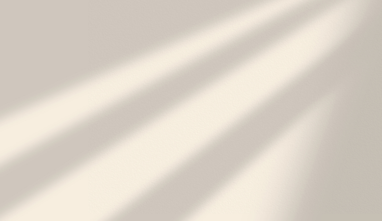
Some rooms feel calm before you notice their colour. Light enters, settles, and stays contained. Surfaces do not glare or dissolve. Nothing asks to be adjusted. The space holds its balance without relying on a particular moment of the day. This calm is often attributed to “neutral tones,” but what is felt here has less to do with colour than with how materials behave once light touches them.
In houses shaped by strong daylight and long hours of occupation, this distinction becomes clear quickly. Rooms are used from morning to evening. Light arrives from the side as much as from above. Surfaces are seen in full sun, reflected light, and shade. What feels calm across these conditions is rarely neutral in the strict sense. It is natural in its response.
Neutral as an appearance
Neutral materials are designed to recede. They are chosen to avoid contrast, to remain quiet, to let other elements speak. Pale paint, soft beige, light grey. These surfaces depend on balance. When light is even, they disappear successfully. When conditions are right, they feel calm.
But neutrality is a visual strategy. It works as long as nothing disrupts it. A change in light, a strong reflection, a shadow at the wrong angle can expose its fragility. In bright environments, neutral surfaces often struggle to hold depth. They flatten. They glare. They lose consistency from one hour to the next.
This does not mean they are wrong. It means they are conditional. Neutrality needs careful lighting, controlled contrast, and frequent correction to remain calm.
Natural as behaviour
Natural materials behave differently. Their calm does not come from trying to disappear, but from how they absorb and return light. Texture breaks reflection. Density softens contrast. Colour is present, but not asserted.
Stone does not react the same way at noon as it does in the evening, yet it remains legible. Lime plaster holds light unevenly, creating depth rather than glare. Wood warms without brightening. These materials do not aim to be neutral. They aim to be stable.
This stability is felt through use as much as through sight. Surfaces accept touch. They mark time. They age gradually instead of failing suddenly. Their behaviour remains consistent even as conditions change. That consistency is what reads as calm. The same behaviour appears across rooms in Materials That Repeat, where continuity allows the house to read as one thing.
When neutrality fails
In strong daylight, the limits of neutrality become visible. Pale surfaces can turn harsh at certain hours. Rooms feel washed out or unsettled. Furniture is added to compensate. Textiles are layered to soften glare. Objects are introduced to give depth that the surfaces themselves cannot provide.
The space begins to depend on correction. Calm becomes something that has to be maintained rather than something that holds on its own. At different times of day, the room feels like a different place. Nothing is technically wrong, yet nothing fully settles.
This instability is rarely discussed directly. It appears instead as restlessness. A sense that the room only works under specific conditions. That it needs to be managed. Living Room Materials and Finishes shows what the alternative looks like in practice — surfaces chosen to age rather than to perform.
Calm that does not depend on light
Natural materials allow calm to persist without constant adjustment. They hold their balance in full sun and in shade. Morning, afternoon, evening. Occupied or empty. The space remains legible.
This is why houses shaped by climate and daily use rely less on neutrality and more on material behaviour. Calm is not achieved by removing colour, but by choosing surfaces that can live with light rather than fight it. Materials that do not ask to be protected from their environment.
Why natural reads as restraint
Natural materials read as restraint not because they are quiet in colour, but because they accept conditions without negotiation. A lime wall does not insist on a particular light; it works under all of them. A linen curtain does not perform softness; it allows softness when softness is what the room needs. A stone floor does not signal anything about taste; it carries the room.
This kind of restraint is structural, not aesthetic. It is the willingness of the material to do less than it could. The wall does not call attention to its plaster, even though the plaster is doing the regulating. The floor does not present its stone, even though the stone is what makes the room cool underfoot. The material disappears into the use it was chosen for.
What a natural surface offers, then, is not a particular look — it is a particular discipline. The room is held together by the agreement of the materials to behave consistently rather than to perform individually. That agreement is what produces the calm we recognise in well-made Mediterranean interiors. It is not minimalism. It is the absence of negotiation.
The difference between natural and neutral is not aesthetic. It is practical. One depends on conditions being right. The other carries its own equilibrium. In spaces meant to be lived in throughout the day, that difference becomes the quiet foundation of comfort — and the reason Color in the Living Room treats colour as the consequence of material rather than its starting point.
Contact
© 2025. All rights reserved.
An editorial study of French Mediterranean interiors, shaped by observation, lived experience, and a respect for spaces that age gracefully.