
How to Choose the Best White Paint for a Mediterranean Interior
Most white walls read cold or clinical, not badly chosen, just picked without undertone, light, or finish in mind. Learn how to choose a warm Mediterranean white through undertone, orientation, and finish.
GUIDESMATERIALS & MAINTENANCE


White should have been the easiest decision.
Instead, the room feels colder than before. The light seems harsher. The walls look flat, almost clinical, and suddenly the Mediterranean atmosphere you were hoping for has disappeared.
The problem is rarely that you chose white.
More often, it is that you chose the wrong white for the light, the materials, and the way the room is actually used.
Mediterranean interiors are rarely defined by brilliant white walls. They are defined by whites that sit quietly with stone, wood, linen, and changing daylight. The colour is only part of the equation. Undertone, finish, and natural light matter just as much.
Not Really White
When people imagine Mediterranean interiors, they often picture crisp white walls glowing in the sun.
Traditional houses tell a different story.
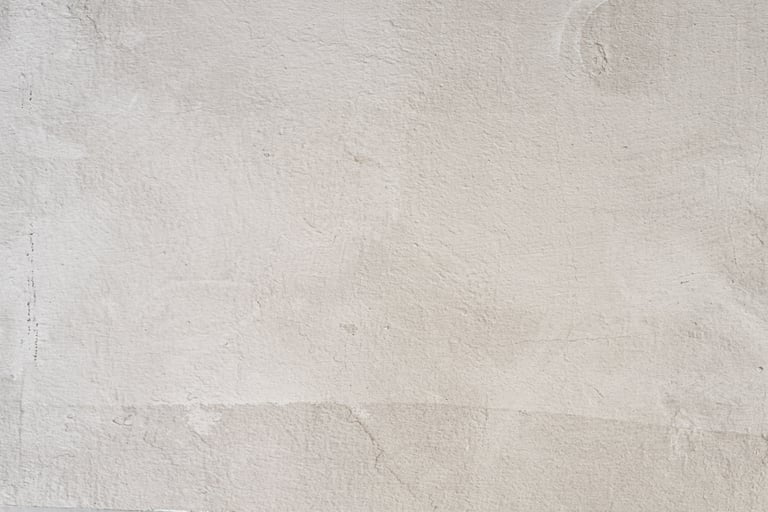
Their walls were finished with lime, chalk, stone dust or mineral washes applied by hand. These surfaces carried subtle traces of sand, ochre and natural pigments. Time softened them further. Even when they looked white, they were never stark.
That is why Mediterranean walls rarely feel bright in the modern sense. They feel soft, settled and quietly luminous.
Trying to recreate that atmosphere with a brilliant white acrylic paint often produces exactly the opposite result.
Undertone Before Shade
Every white paint has an undertone, even those described as pure or neutral.
Cool whites lean towards blue or grey.
Warm whites lean towards yellow, red, cream or soft ochre.
On a paint card, the difference may seem almost invisible. On an entire wall, it changes the character of the room.
A cool white can make warm limestone flooring look slightly dirty. It can fight against oak, terracotta and linen instead of supporting them.
A warm white does not necessarily look yellow. In fact, many of the best Mediterranean whites appear almost neutral until they are placed beside a cooler white. Their warmth only becomes visible through comparison.
This is why two paints that seem identical in the shop can create completely different interiors once they are on the wall.
Materials Before Paint
One of the most common decorating mistakes is choosing paint first.
Mediterranean interiors work in the opposite order.
The floor, stone, wood or main architectural material should come first. Paint exists to support those materials, not compete with them.
If your flooring leans warm, your white usually should too.
If your walls are chosen before the room's permanent materials, the chances of repainting later increase considerably.
This same order, materials first, colour last, is what The French Mediterranean Living Room is built around.
Same White, Different Light
White never exists on its own.
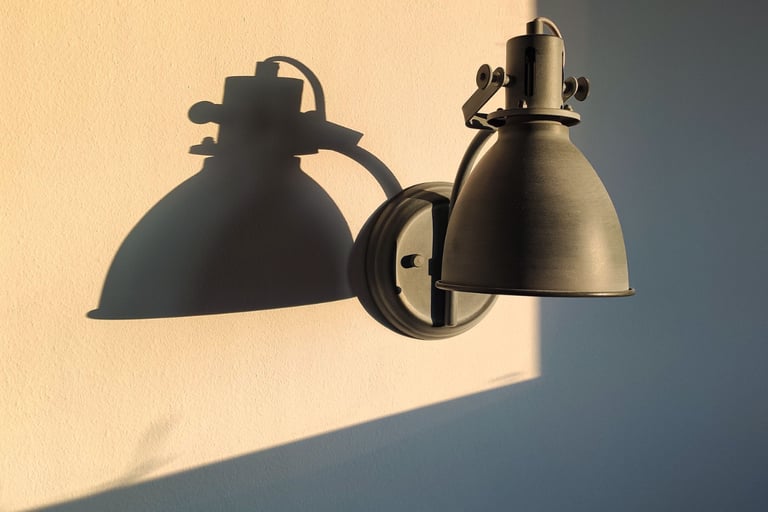
It is constantly shaped by natural light.
A north-facing room receives cooler, flatter daylight throughout most of the day. Warm whites often need to be warmer than expected simply to appear balanced.
An east-facing room feels cooler in the morning and gradually softens through the afternoon.
A west-facing room receives its strongest light later in the day. Whites that feel understated in the morning may become rich and warm during golden hour.
South-facing rooms receive the strongest direct light. Here, warm whites often reveal their full depth without becoming heavy.
This is not a reason to use different colours everywhere. It is simply a reminder that the same paint will never behave the same way twice.
If you want to read your own light before choosing, the Light Audit is a short walk-through of how a room's daylight shifts through the day.
How to Make a New Build Feel More Mediterranean explores why orientation influences almost every design decision in a house.
Finish Changes the Wall
The same colour in two different finishes is no longer the same wall.
Standard matt emulsion reflects light evenly across the surface.
Limewash and mineral paints behave differently.
Instead of reflecting light, they absorb and scatter it. Small variations in texture create depth, movement and softness that a perfectly smooth painted wall cannot reproduce.
This is one of the reasons Mediterranean interiors rarely feel flat.
If your walls are perfectly smooth plasterboard, changing the finish often has a greater impact than changing the colour itself.
Whenever possible, choose a deeply matt finish. Mediterranean interiors depend more on light absorption than on light reflection.
How to Soften a Bright Room Without Making It Dark applies this same principle to an entire room, not only the walls.
Walls and Ceilings Together
In many Mediterranean homes, yes.
Using the same warm white across walls and ceilings creates continuity and allows natural light to become the main source of contrast.
Painting ceilings brilliant white while walls remain warmer often creates an unnecessary visual break.
Unless your ceilings are exceptionally low or require a specific architectural treatment, keeping both surfaces in the same family usually produces the calmer result.
Trim Without Contrast
Mediterranean interiors rarely depend on strong white trim for contrast.
Painting doors, skirting boards and window frames in the same colour, or only one shade apart, creates quieter transitions and lets materials take visual priority.
The architecture becomes more important than the joinery.
Not Every Room Alike
Generally, yes.
But the same white may not suit every room equally well.
A cool north-facing hallway may need a noticeably warmer white than a sun-filled living room.
Bathrooms often benefit from softer mineral finishes that reduce glare.
Bedrooms usually feel calmer with muted, chalky whites rather than crisp contemporary whites.
Always let the room guide the decision rather than applying one rule everywhere.
Test Before You Commit
A paint card tells you very little.
A computer screen tells you even less.
Buy sample pots.
Paint at least a 40 × 40 cm section directly onto the wall.
View it:
in the morning
at midday
in the evening
on a sunny day
on an overcast day
The version that looked perfect in the shop is rarely the version you actually live with.
Testing takes time.
Repainting an entire room takes far longer.
Type Before Colour
Before choosing a colour, choose the type of paint.
This matters more than many people realise. Two paints can have almost identical colours yet create completely different walls because they reflect light differently.
Mediterranean interiors rely on soft, light-absorbing surfaces rather than perfectly smooth, reflective ones. The finish often shapes the atmosphere as much as the shade itself.
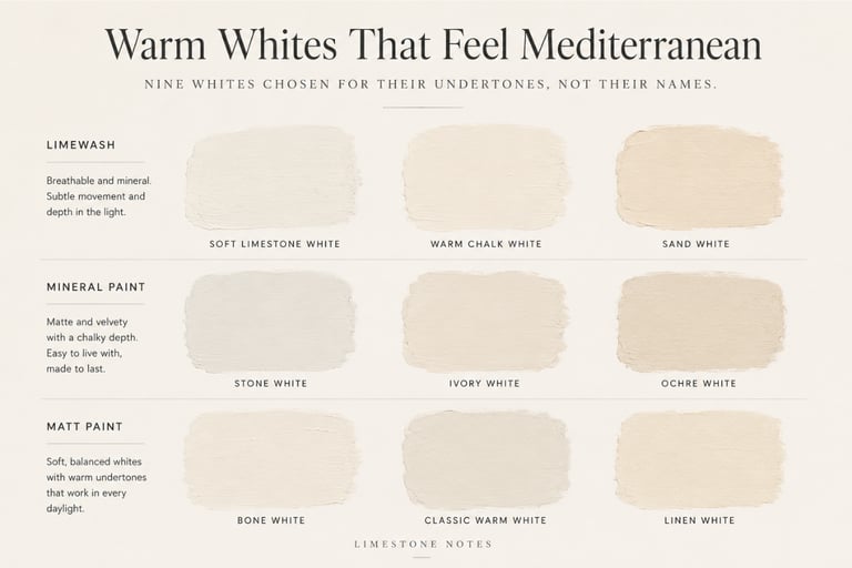
Limewash
Limewash is the closest finish to traditional Mediterranean walls.
Rather than creating a perfectly uniform surface, it produces subtle variations that catch the light differently throughout the day. The result feels softer, older and more natural than conventional paint.
If authenticity is your priority, limewash is difficult to surpass.
Recommended brands
Bauwerk
A specialist in traditional limewash. Raw White and Bone are warm without becoming creamy, while Ibiza introduces a subtle sandy tone that works beautifully in strong southern light.
Ressource
Founded in Provence, Ressource develops colours inspired by the ochres and natural pigments of southern France. Their lime paint range is particularly well suited to French Mediterranean interiors.
Best suited for
Living rooms
Bedrooms
Entrance halls
New builds that need more warmth and character
Renovation projects where texture is part of the design
Mineral Paint
Mineral paints offer many of the visual qualities of limewash while being easier to apply and maintain.
They create a deep matt finish that absorbs light beautifully, giving walls more depth than standard emulsion without the movement typical of limewash.
For many homes, they offer an excellent balance between practicality and atmosphere.
Recommended brand
Graphenstone
Manufactured in Spain, Graphenstone combines natural lime with mineral pigments to create breathable, low-VOC paints with a beautifully soft appearance.
Best suited for
Contemporary Mediterranean homes
Bathrooms and kitchens
Homes where durability and breathability are both important
Conventional Matt Paint
Limewash is not essential to create a Mediterranean interior.
A high-quality matt emulsion can produce an equally convincing result if the undertone is chosen carefully.
The flatter the finish, the calmer the wall will appear.
Recommended brands
Farrow & Ball
Pointing is one of the most reliable warm whites available. It carries a gentle warmth without becoming obviously creamy.
Clunch is slightly earthier and works particularly well with natural stone and timber.
Little Greene
Slaked Lime offers a soft, chalky warmth that complements limestone, oak and linen without drawing attention to itself.
Best suited for
Renovations
Easy maintenance
Homes where touch-ups may be needed over time
Anyone looking for a simpler application than limewash
If Unavailable Locally
These manufacturers are widely available across Europe. Farrow & Ball, Graphenstone and Bauwerk are also distributed throughout much of the United States, while Little Greene is available through specialist retailers.
If your preferred brand is unavailable, don't try to match the name.
Instead, compare the undertone, the finish and the overall warmth with local manufacturers.
A warm, deeply matt white from another brand will usually produce a better Mediterranean result than an exact colour match in the wrong finish.
Before Buying Paint
Before making a final decision, ask yourself:
What is the dominant permanent material in the room?
Does it lean warm or cool?
Which direction does the room face?
At what time of day will it be used most?
Would a mineral paint or limewash improve the surface?
Have you tested a large sample on the actual wall?
Does the white lean gently warm rather than blue or grey?
Have you chosen your flooring before choosing your paint?
White paint is never really about white.
It is about light, material and finish.
Colour is simply where those three decisions become visible.
Choose the undertone before the shade.
Choose the finish before the brand.
Choose the materials before the paint.
Only then choose the name on the paint chart.
What Patina Means in a Well-Made House carries this same logic through the rest of the house, not only the walls.
Common White Paint Questions
What is the best white paint for a Mediterranean interior?
A warm, deeply matt white that sits with stone, wood and linen, such as Farrow & Ball Pointing or a Bauwerk limewash, rather than a brilliant cool white.
Should a Mediterranean white be warm or cool?
Warm. Cool whites make limestone and oak look dirty, while a warm white supports natural materials instead of fighting them.
What white works best in a north-facing room?
North light is cool and flat, so the white usually needs to be warmer than you would expect simply to look balanced.
Is limewash better than paint for a Mediterranean look?
Limewash is closest to traditional walls because it scatters light and adds subtle movement. A high-quality matt emulsion also works if the undertone is right.
Should walls and ceilings be the same white?
In most Mediterranean homes, yes. The same warm white across both lets daylight, not paint, create the contrast.
When you are ready to test your own room, the Light Audit gives you a simple way to see how its light changes from morning to evening.
Contact
© 2025. All rights reserved.
An editorial study of French Mediterranean interiors, shaped by observation, lived experience, and a respect for spaces that age gracefully.