Color in the Bathroom
How color holds a Mediterranean bathroom together quietly — light first, material second, palette last. Why mineral tones outlast strong contrast in this room.
BATHROOM
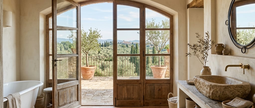
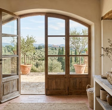
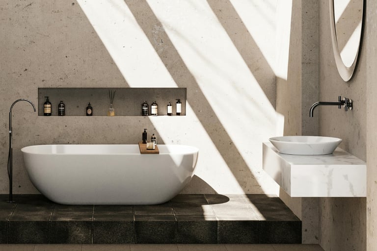
Color in a French Mediterranean bathroom does not seek attention.
Its role is to maintain continuity, support light, and allow materials to remain legible. When color asserts itself, the bathroom feels artificial. When it recedes, the room settles into use.
Contrast is reduced. Transitions are softened. The space remains calm even during brief moments — a condition introduced in The French Mediterranean Bathroom.
Color responds to light
Bathroom light is variable and often indirect.
Colors must remain stable under changing conditions, from early morning to evening, from daylight to artificial light. Mineral tones respond best. They absorb light gently and avoid sharp shifts.
Whites are rarely pure. They carry warmth, depth, or a trace of stone. Pale earth tones soften surfaces without darkening them.
Cool or high-contrast colors tend to become harsher as light fades. Light & Enclosure in the Bathroom returns to why.
A limited range of tones
The bathroom benefits from restraint.
One dominant tone, supported by subtle variations, is usually sufficient. Floors, walls, and built elements remain closely related in value.
Differences appear through texture rather than hue.
Strong contrast fragments the room. It draws attention to boundaries rather than allowing the space to read as a whole.
A restrained palette keeps the room visually quiet, even when surfaces are wet or reflective.
The reason this restraint reads as calm rather than absence is developed in The Difference Between Natural and Neutral.
Color carried by material
Color in the bathroom is rarely applied.
It emerges from material itself. Stone introduces variation through grain. Plaster carries irregularity. Wood adds warmth without relying on pigment.
These materials create depth without saturation. Color feels embedded rather than added.
When material carries color, the room remains coherent without effort. Materials for Contact in the Bathroom shows how the surfaces themselves do this work.
Fixtures remain secondary
Color should not isolate fixtures.
Basins, baths, and showers belong to the same tonal family as the room. They do not stand apart through contrast.
This allows fixtures to recede and the architecture to remain present.
When fixtures are emphasized through color, they become objects. When they remain aligned, they support routine quietly — a relationship developed in Fixtures as Architecture in the Bathroom.
Avoiding visual emphasis
Bathrooms are not spaces for accent color.
Bold hues, decorative patterns, or strong contrasts introduce energy that conflicts with the room’s purpose. Even in small amounts, they tend to dominate.
If variation is needed, it comes from texture, depth, or light, not from color shifts.
The room should feel composed even in brief use.
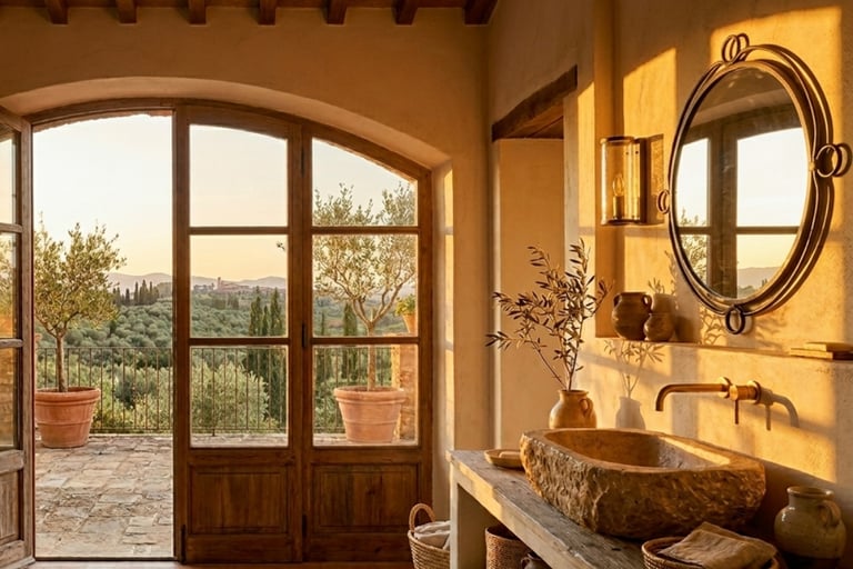
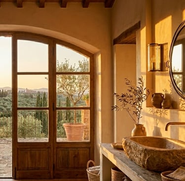
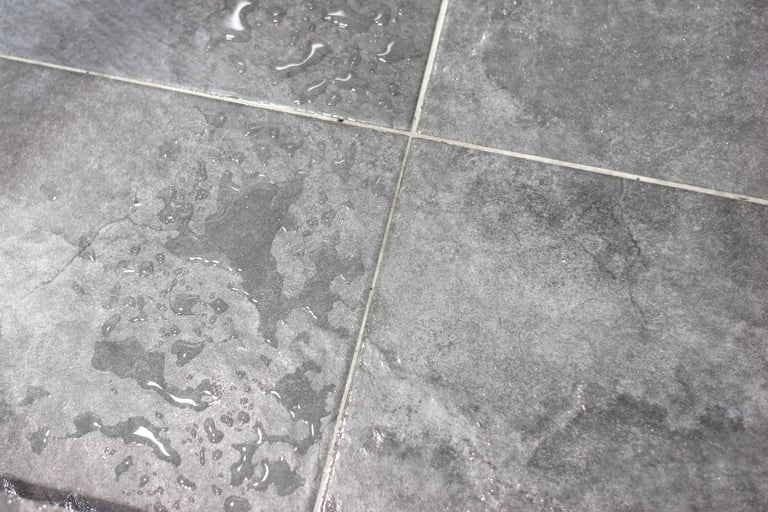
Color in wet light
Bathrooms are the only room where every surface is regularly seen wet.
Wet surfaces reflect light differently. A plaster wall lightens slightly when damp from a shower. A stone floor deepens. A tiled basin can flare under direct light when water sits on its surface. A palette that reads as continuous when dry can shift its proportions noticeably after twenty minutes of use — and a bathroom that only looks resolved when dry is a bathroom that spends half its life looking unresolved.
Mineral tones absorb this shift gracefully. Their tonal range stays narrow whether the surface is wet or dry. They do not flare. They do not collapse. Strong pigments and high-contrast palettes do the opposite — they amplify the difference between wet and dry, and the room loses coherence each time it is used.
A bathroom palette is tested in steam more than in showroom light. If the room still reads as one composition after a hot shower, the colors are right.
A room that holds together
A well-resolved bathroom palette feels continuous.
Morning and evening read the same. Artificial light does not alter the atmosphere. Surfaces remain calm and legible at all times.
Color supports the room without defining it. It allows light, material, and enclosure to remain primary.
When contrast is avoided, the bathroom becomes what it is meant to be: a room that supports daily care, then recedes without leaving a trace.
Contact
© 2025. All rights reserved.
An editorial study of French Mediterranean interiors, shaped by observation, lived experience, and a respect for spaces that age gracefully.