Color in the Kitchen
How color holds a Mediterranean kitchen together quietly — material first, light second, palette last. Why mineral tones outlast accent in a working room.
KITCHEN
Color in a French Mediterranean kitchen does not seek attention.
Its role is to support work, soften light, and allow materials to remain legible under constant use. When color becomes expressive, the kitchen feels unsettled. When it recedes, the room remains steady — a condition introduced in The French Mediterranean Kitchen.
Continuity matters more here than in any other room.
Color follows material
In Mediterranean kitchens, color is rarely applied.
It emerges from stone, wood, and lime rather than from paint alone. These materials introduce tonal variation without contrast, allowing the room to remain cohesive even as surfaces age.
Pigmented finishes are used sparingly. Strong hues tend to amplify wear and fragment the space. Mineral tones absorb change more quietly.
Materials for Work in the Kitchen returns to this surface by surface — when material carries colour, the kitchen stays composed without effort.
Stability under changing light
Kitchen light shifts throughout the day.
Morning, midday, and evening light each alter how surfaces are read. Colors must remain stable across these conditions without becoming harsh or dull.
Warm whites, muted stone tones, and soft earth colors respond best. They hold their character as light changes, preventing the room from feeling different at each hour.
This stability supports the rhythm established by daily use, as explored in Light and Rhythm in the Kitchen.
A narrow tonal range
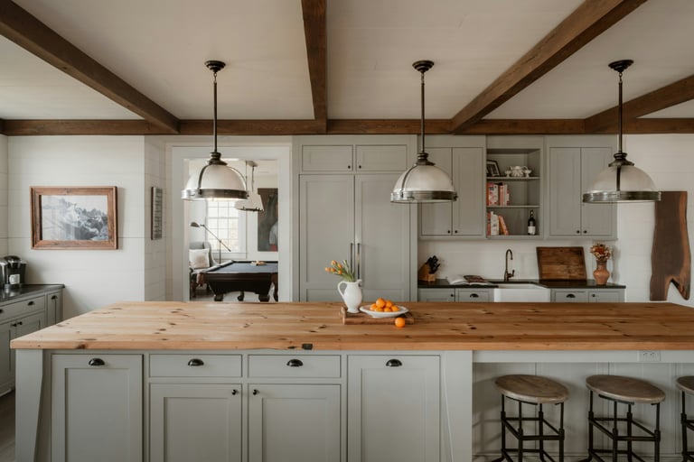
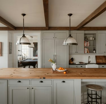
The kitchen benefits from a limited palette.
Walls, storage, and work surfaces remain closely related in tone. Variation comes from texture and material rather than hue. This restraint keeps the room visually calm even when active.
Strong contrast interrupts continuity. Dark accents, decorative patterns, or sharp transitions pull focus away from work and toward appearance.
A narrow range allows the kitchen to feel unified rather than composed of parts.
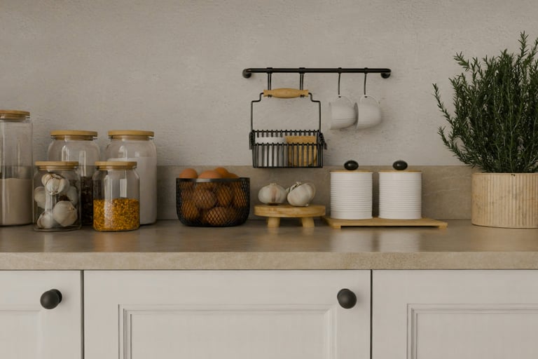
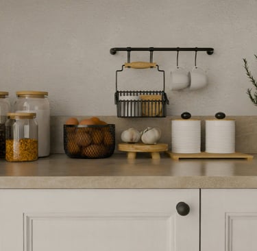
Storage recedes, color follows
Color should never highlight storage.
Cabinet fronts and built elements remain aligned with walls rather than distinguished from them. When storage is emphasized through color, it becomes furniture. When it recedes, the room reads as architectural.
This alignment supports the role of storage as background, as developed in Storage as Background in the Kitchen.
Wear as part of the palette
In a kitchen, wear is inevitable.
Small marks, shifts in tone, and patina appear over time. Colors chosen for continuity absorb these changes rather than exposing them.
Highly contrasted or saturated colors exaggerate wear and require correction. Restrained tones accept it.
The kitchen should feel better with use, not worse.
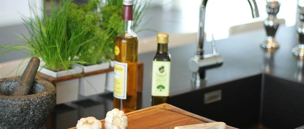
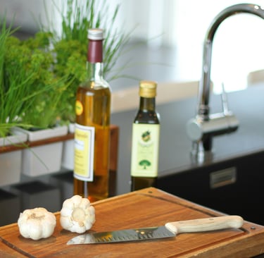
Color when in use
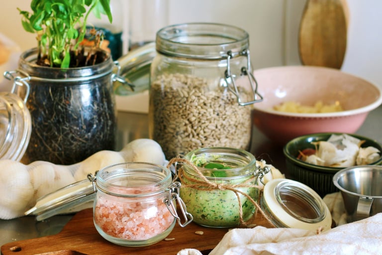
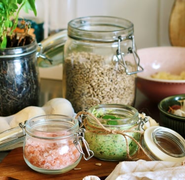
A kitchen is the only room where strong color regularly enters and leaves.
A board of red tomatoes on the counter. A bunch of basil. A copper pan on the cooktop. A jar of saffron, open. These arrive in handfuls and disappear into a meal, but while they are there they introduce more saturated colour than the rest of the room contains across an entire week.
A palette built only for the empty kitchen will fight this. Strong wall colour, contrasting fronts, decorative tiles — all become loud the moment ingredients land on the counter. The room turns visually crowded the second cooking begins.
A restrained kitchen does the opposite. The walls and surfaces hold back, and the ingredients become the palette while they are out. A tomato reads as red against a stone counter in a way it never does against a coloured one. When the cooking finishes and the counter is cleared, the room returns to its quiet state without leftover noise.
The kitchen palette has to work both empty and full. Most kitchens are only designed for one.
Why this kind of restraint reads as alive rather than as absence is the subject of The Difference Between Natural and Neutral.
A room that holds together
A well-considered kitchen palette feels continuous.
Light changes without disruption. Materials age without conflict. The room remains readable and calm even during intense activity.
Color supports the kitchen without defining it. It allows work, rhythm, and material honesty to remain primary.
This coherence becomes clearer when surfaces are understood as the structure of the room, as developed in Kitchen Work Surfaces as Structure.
When continuity is maintained, the kitchen settles into daily life and stays there.
Contact
© 2025. All rights reserved.
An editorial study of French Mediterranean interiors, shaped by observation, lived experience, and a respect for spaces that age gracefully.